Google loves to tinker with the interface of its apps. Nothing ever stays the same, nothing ever remains consistent. One day, you know where the Trash is in Google Photos, the next, it's gone to a whole other menu. Change is the motto of any Android enthusiast.
That kind of tinkering keeps things interesting for us, but it makes using crucial apps in a pinch very, very annoying, especially after an unexpected update and a poorly-thought interface change.
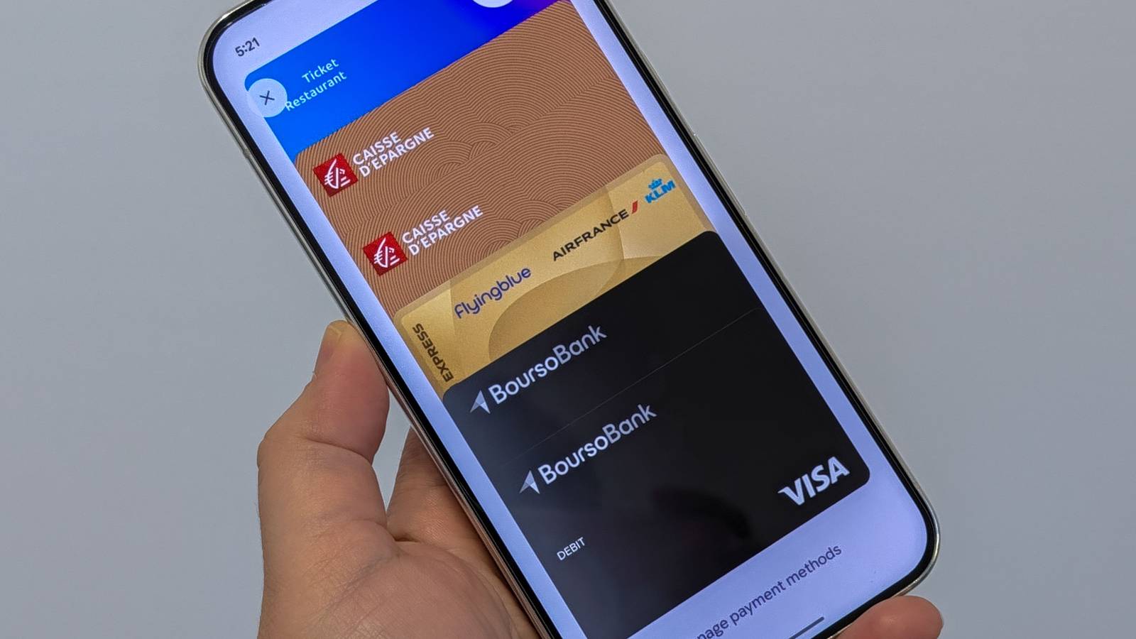
A recent example of that is the new Google Wallet app, which rolled out its over the last couple of weeks and surprised me when I was checking out at a store. I wanted to pick the right card, but there were two that looked identical, and I was left scratching my head about which one to use. Here's the problem and the four tricks I've used to avoid it.
The problem with the current card stack
Which card is which, Google?
Google Wallet used to display all your payment cards in a horizontal scrolling carousel. The main card was the first one, and you could swipe to reveal the others, card by card. Each one had the last four digits displayed as well as the card nickname below it.
It was easy to pick out a card by color and design, of course, but if you had two similar or identical cards from one bank, it was relatively easy to spot which one is which by checking the name or the four last digits of the number. The new vertical stack ruins that.
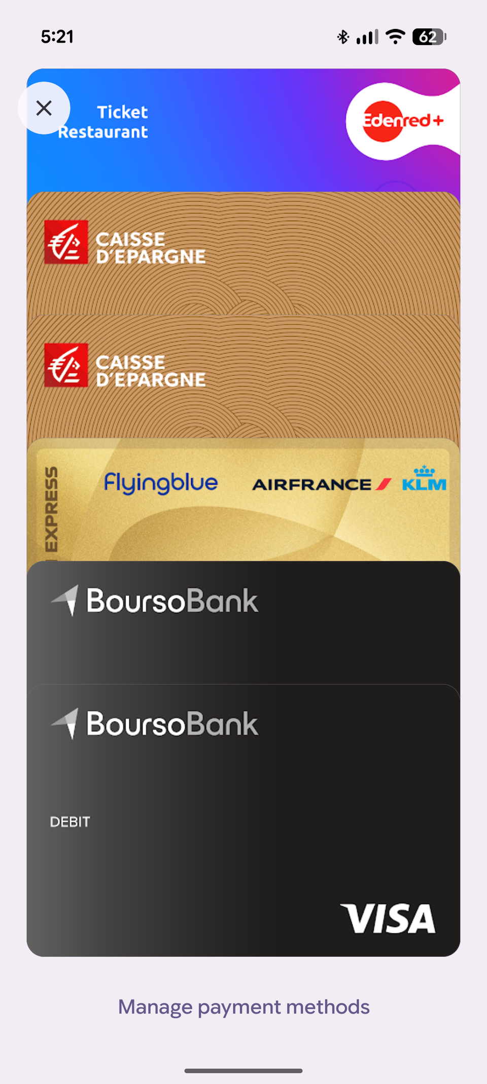
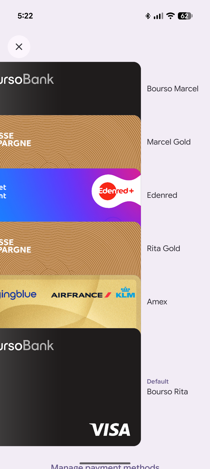
Putting aside that everything requires a few more taps than necessary, it's impossible to differentiate two identical cards. I had this issue while checking out at a store last week: I opened Google Wallet and saw two black cards and two light brown cards stacked with no differentiating visual element.
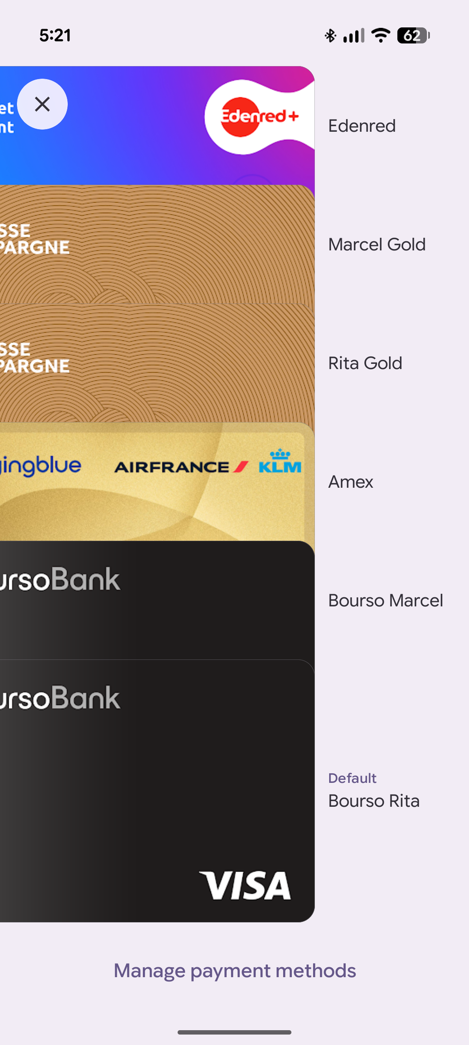
The four digits are gone, and the nickname was nowhere to be found at first. I fumbled and then ended up using one of my unique cards because I didn't want to mess up my accounts and expenses.
Later, I found out that I could drag the cards to the left a bit to reveal their nickname (check the second screenshot above), but there are other ways to fix or avoid this problem. Here are my suggestions.
Fix 1: Give your card unique nicknames
It's tough to be confused when each card has a name
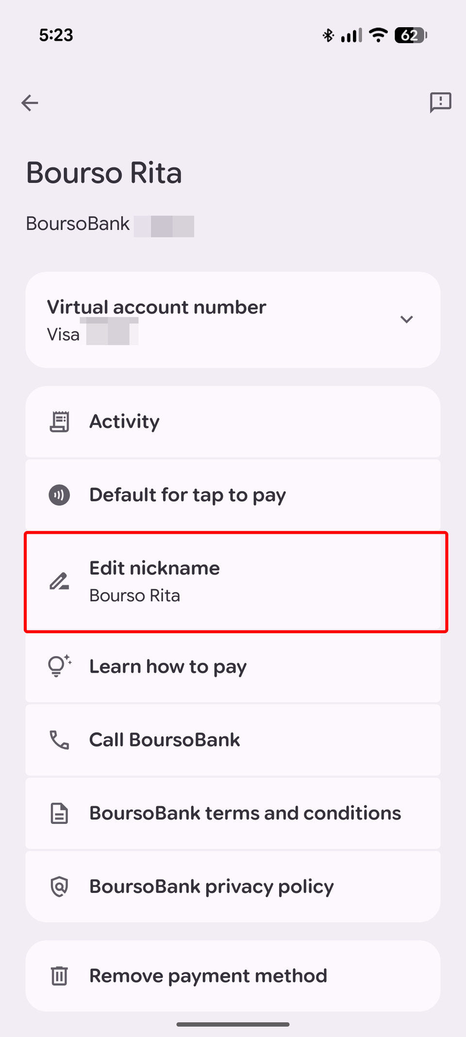
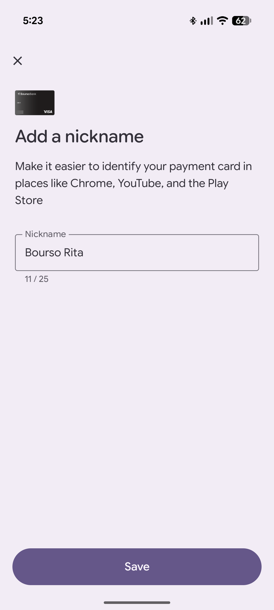
If you have similar-looking or identical cards, the first thing you should do is give them unique nicknames to be able to differentiate them by swiping them. To do that, follow these steps:
- Tap the card stack, choose Manage payment methods.
- Pick the card you want to edit, then the overflow ⋮ button on the top right.
- Choose Edit nickname and write a unique name for the card.
Some of my cards are identical because my partner and I have two different cards for the same account, some are because we have different accounts at the same bank. Either way, just adding "Rita" and "Marcel" to the nicknames of each card helps me easily spot which one is which.
Fix 2: Reorder your cards by importance
Move the lesser used cards away
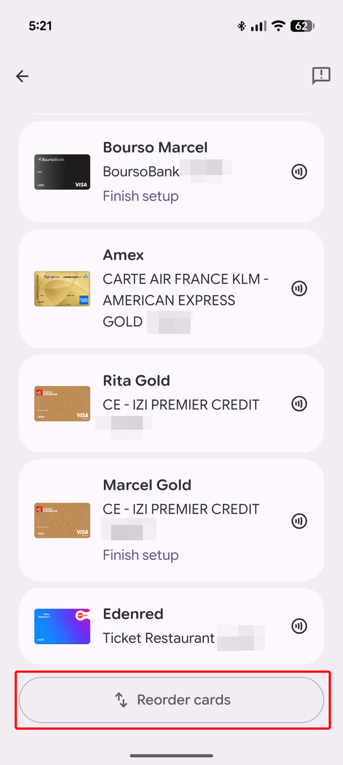
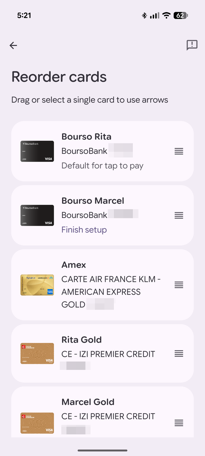
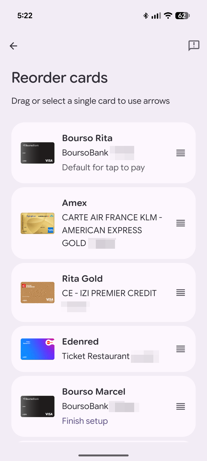
You should also reorder your cards by importance or frequency of use. I obviously use my cards more than my partner's, so it helps to have my cards on top as the most accessible options. To do that, the steps are:
- Tap the card stack, choose Manage payment methods.
- Scroll to the bottom and tap Reorder cards.
- Drag and move each card by order of importance.
I put my partner's cards toward the bottom, and kept mine on top. When using the stack, the stack is inverted, though, so pay attention to that. The card "on top of the stack" is at the bottom of the screen, and the one below the entire stack is at the top. It's a bit confusing.
Fix 3: Make sure you have a default payment card
When all else fails, a default payment method is a good backup
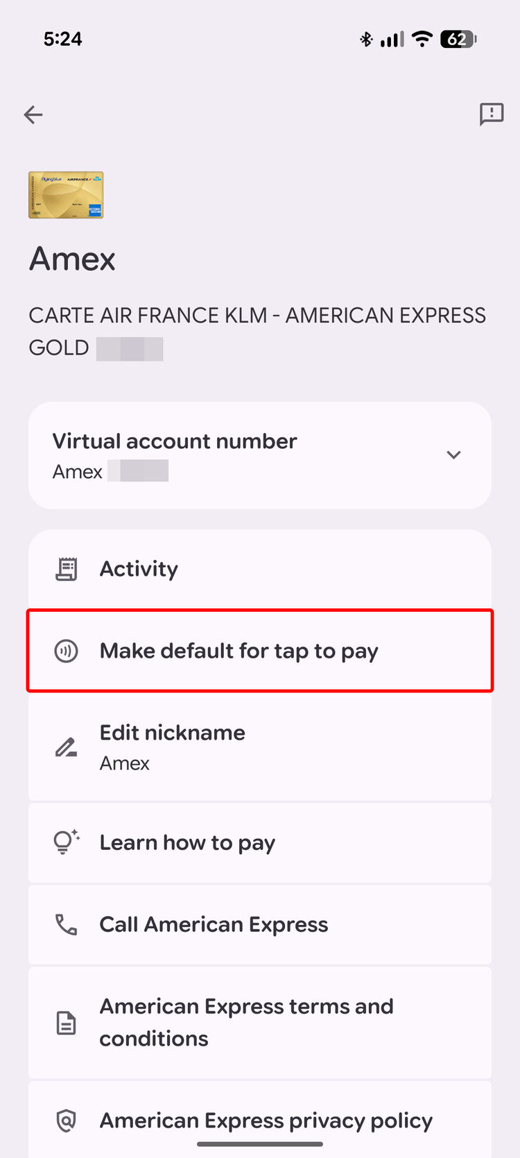
Even if you have multiple cards you frequently switch between for points and rewards, it helps to have one default payment method that your phone defaults to when you just want to tap to pay without thinking about it. Here's how to do that:
- Tap the card stack, choose Manage payment methods.
- Pick the card you want to set as default, then the overflow ⋮ button on the top right.
- Choose Make default for tap to pay.
This helps avoid the confusion around duplicate cards by letting your phone revert to the safest option when you're not sure which card is which. Just don't touch anything when paying, and it will pick the right card each time.
Fix 4: Remove the cards you're not using
Why keep more cards that can confuse you?
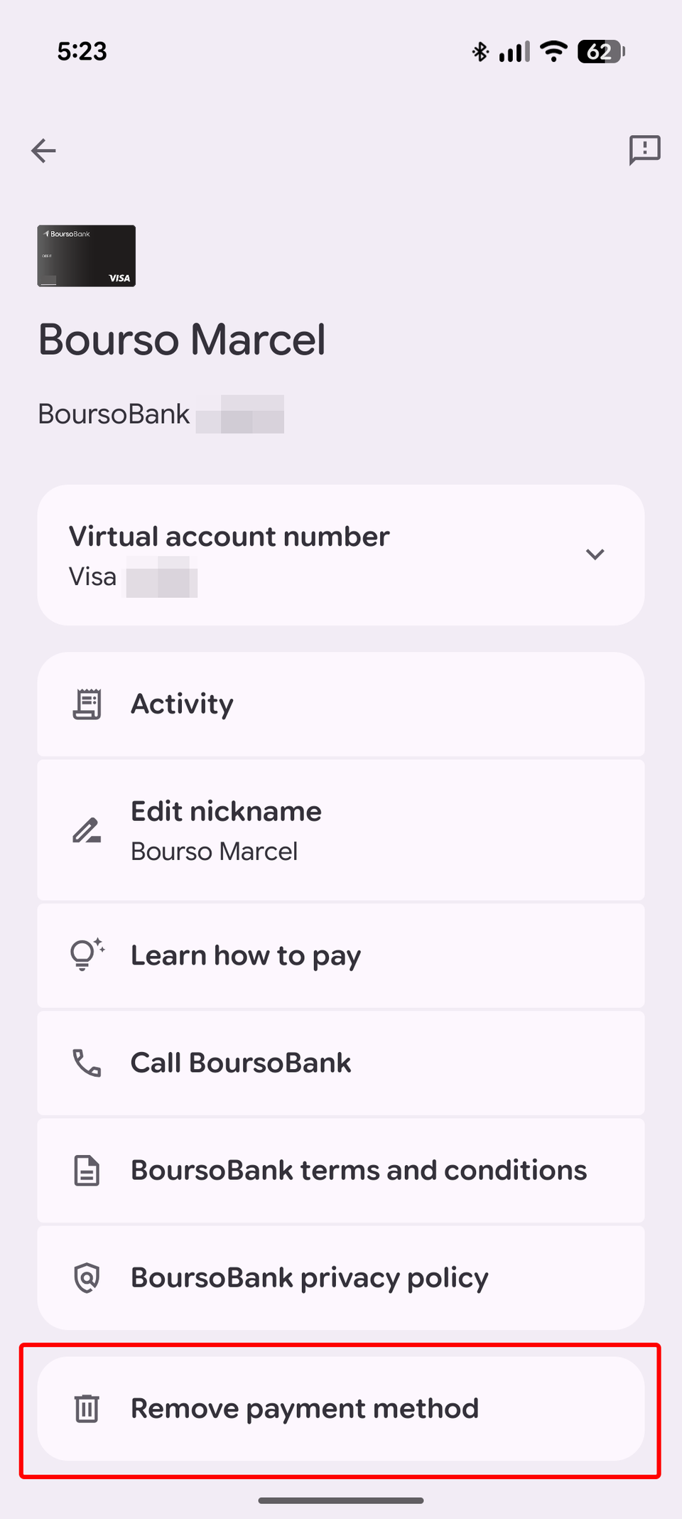
One final drastic solution to this problem is to remove unused cards or cards you seldom need. You can't confuse one card for another if you don't have that duplicate card on your phone, right? Besides, it's a very good .
- Tap the card stack, choose Manage payment methods.
- Pick the card you want to remove, then the overflow ⋮ button on the top right.
-
Scroll down and choose Remove payment method.
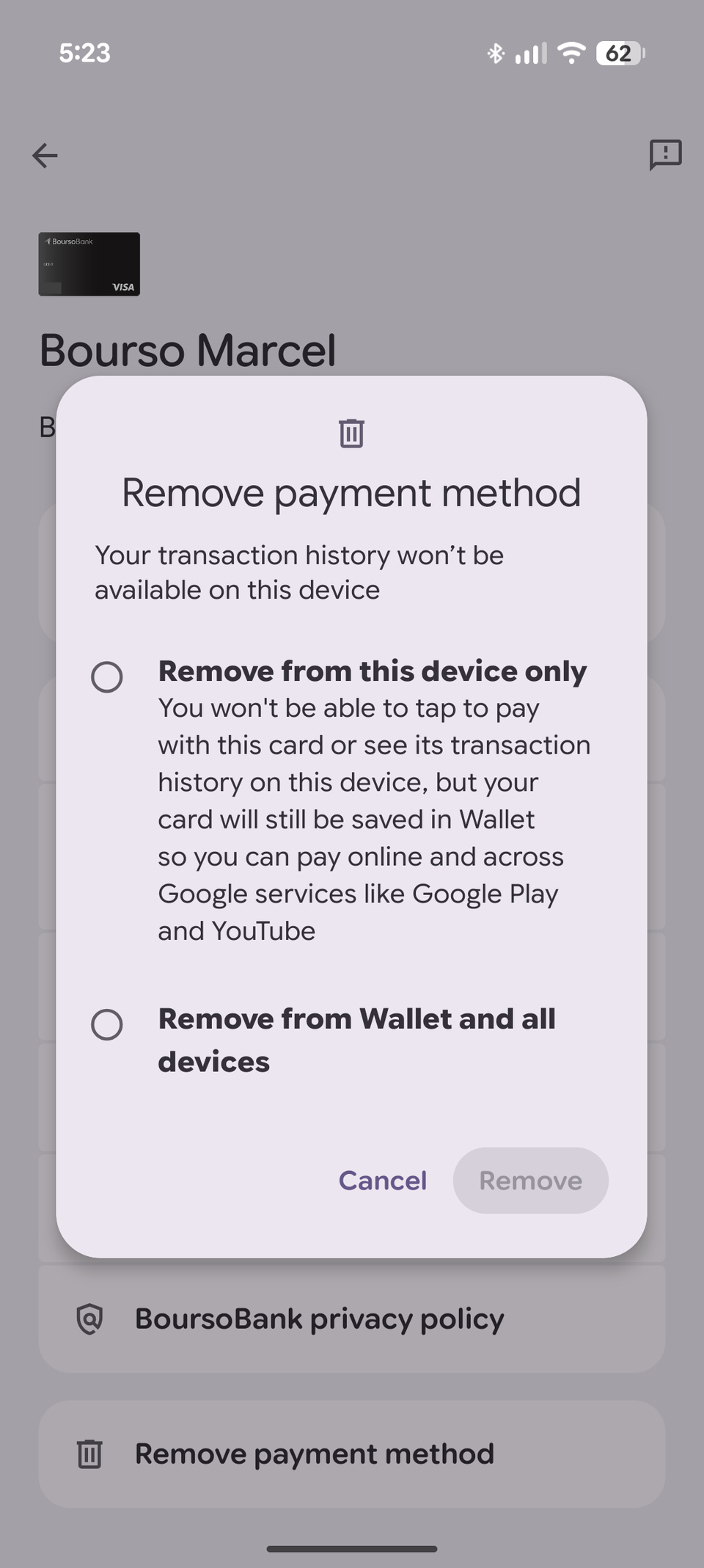
- Choose Remove from this device only if you plan on using this card on another phone or for online payments.
- Choose if you don't want to use this card in person or online anymore.
- Tap .
Because of this interface change, I had to stop and think that I never really use one of my partner's cards on my phone, but I always set it up. What's the point? I removed it from my Pixel, and now there's less risk of confusion.
This is a usability problem and Google should fix it
There are several problems with the new stacked card design in Wallet. The lack of four-digit identification, the invisible card nicknames and labels, the fact that the top card stacks at the bottom of the screen, the inability to easily differentiate two similar cards, and the extra taps are all issues Google should've identified before rolling this out to everyone.
Some UI changes are infuriating. You shouldn't mess with something as delicate as a financial transaction and make picking a payment method more complicated or more annoying for the sake of a cooler look. Never mind the that made payments erratic over the last few weeks and that could've been due to all this unnecessary interface tinkering.