I've been obsessed with Snapchat filters and beauty filters for years. Recently, I've realized the pictures don't age well, and they create an unreal version of my face.
It takes a lot of confidence and self-development to break away from the dysmorphia, and I'm glad it worked. Now, the most playful thing I do with my photos is apply retro-themed filters and a little grit.
They invoke more emotion and nostalgia, if done right. I fall in love with more when pictures come out this way. I don't see myself shooting any differently, and here's why.
Beauty is in the eye of the right camera
It helps if you know which one flatters you most
A beauty filter and an effect filter do completely different jobs, as I've learned over time.
A beauty filter works on you as a person. It maps your facial landmarks and fixes imagined imperfections, such as slimming the jaw and stripping out skin texture, among other corrections.
In contrast, an effect filter works on the photograph as a whole and remaps color. I know which one I prefer, but you decide what works for you.
Lately, I've become a huge fan of Fujifilm's film simulations, built around warm skin tones and restrained contrast. They showed me the problem was never my face.
I just didn't know my angles, and I knew nothing about color grading, so I kept taking "bad pictures."
I eventually improved my mobile photography skills and started shooting with Dazz Camera on my iPhone, with the FXN R body.
Unfortunately, the app isn't on Android, so I moved to Snapseed on my Google Pixel. Then I found I could do something similar in Google Photos with minimal technicalities.
It's amazing having my favorite edits bundled into my native photo manager.
I'm in the mood for vintage photography
It makes me feel like an old-time professional
Moods rolled out on September 24, 2026, as part of a Google Photos update that also brought the Redact tool. Google is still releasing it globally on Android.
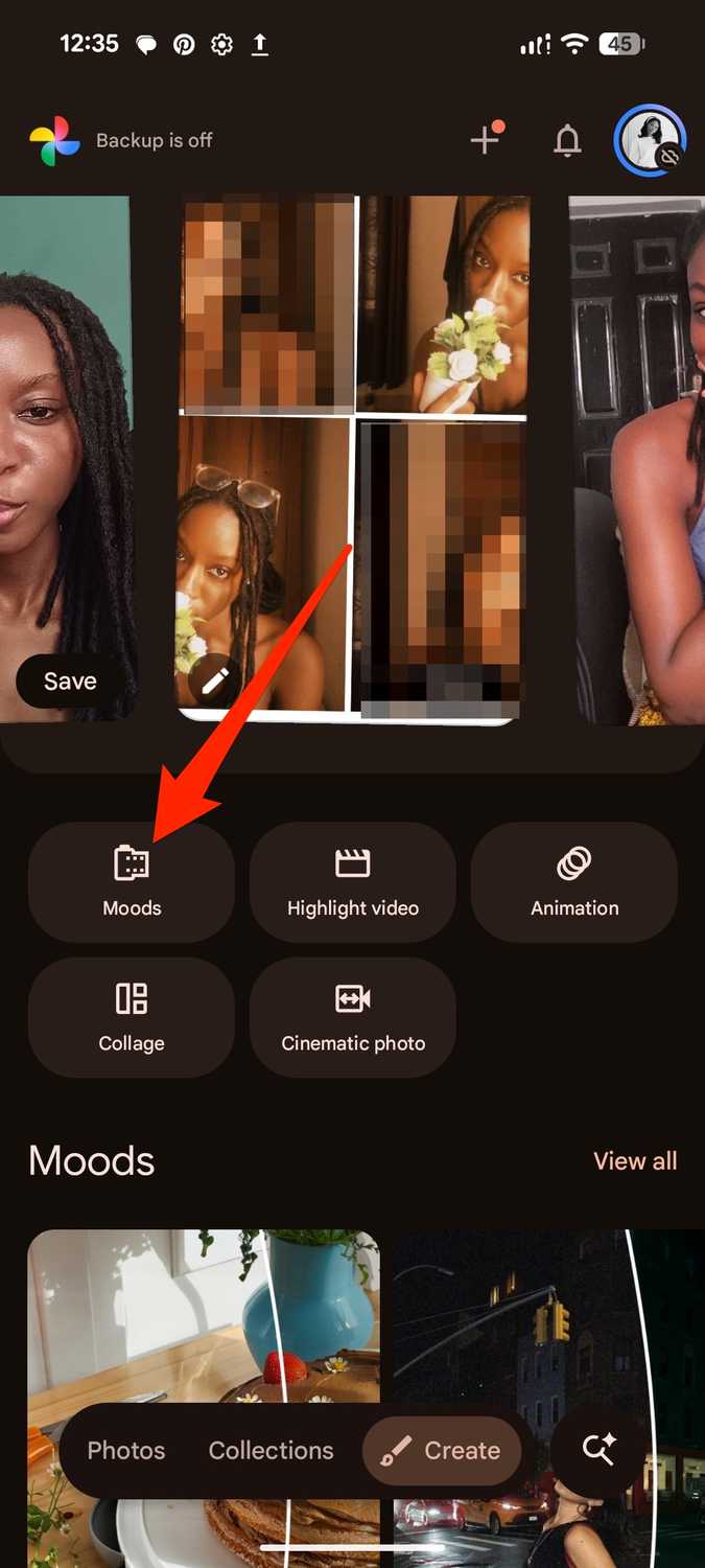
The feature has a simple process that requires no professional editing skills because the presets are already balanced. I go to the menu and tap .
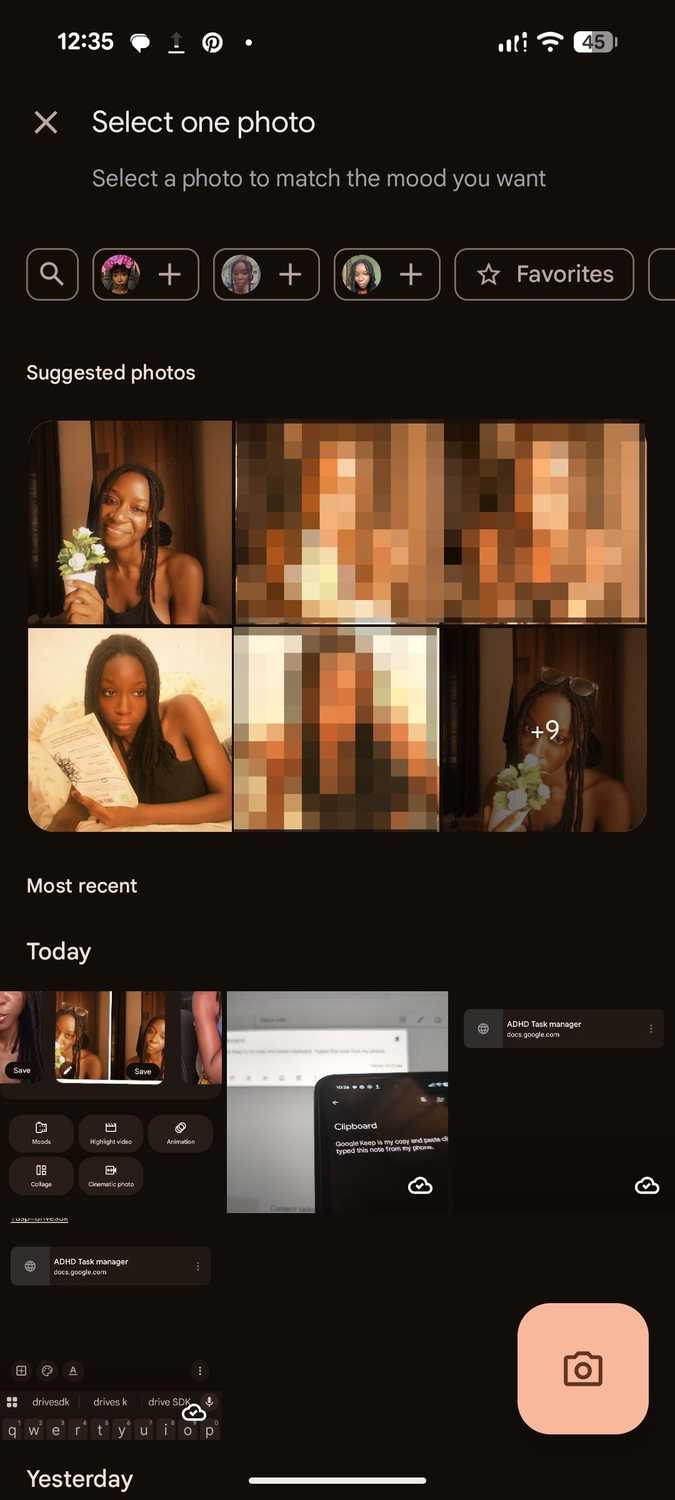
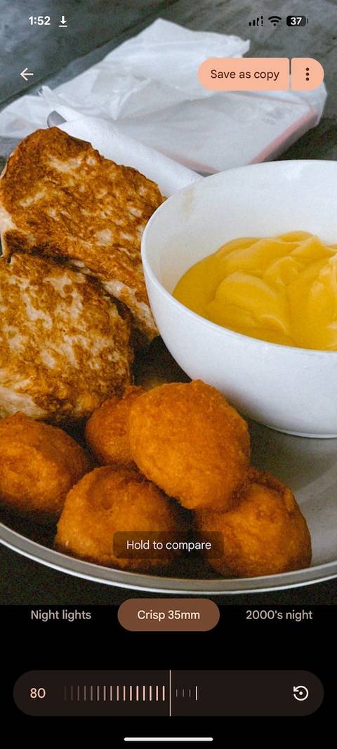
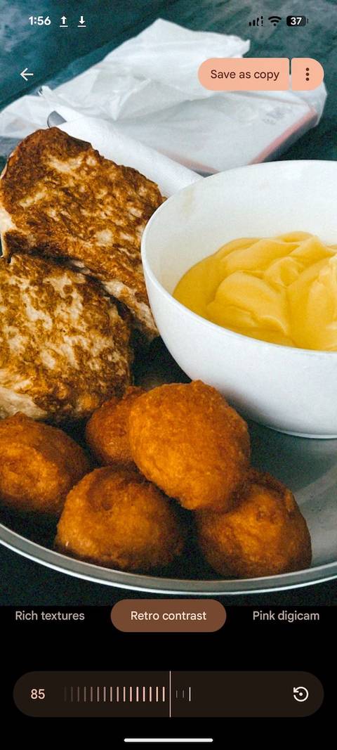
Then open a photo from my gallery or capture a fresh one. Next, I pick a Mood and drag the intensity slider to my preference. I may also hold the image to compare the original with the filtered version.
When I'm done, I save my photo as a copy.
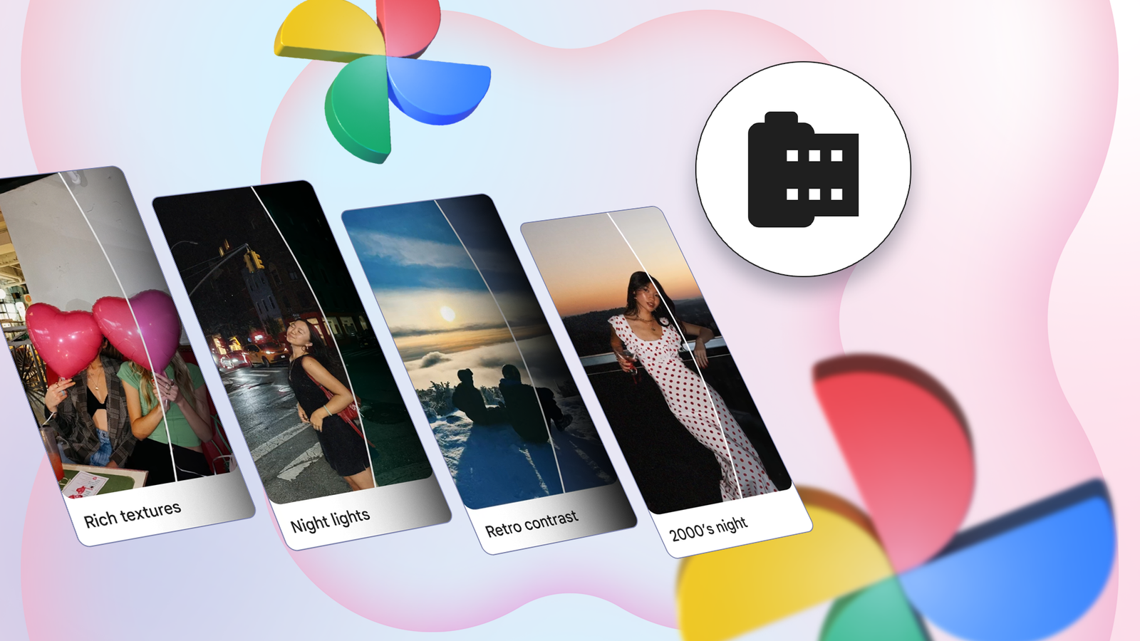
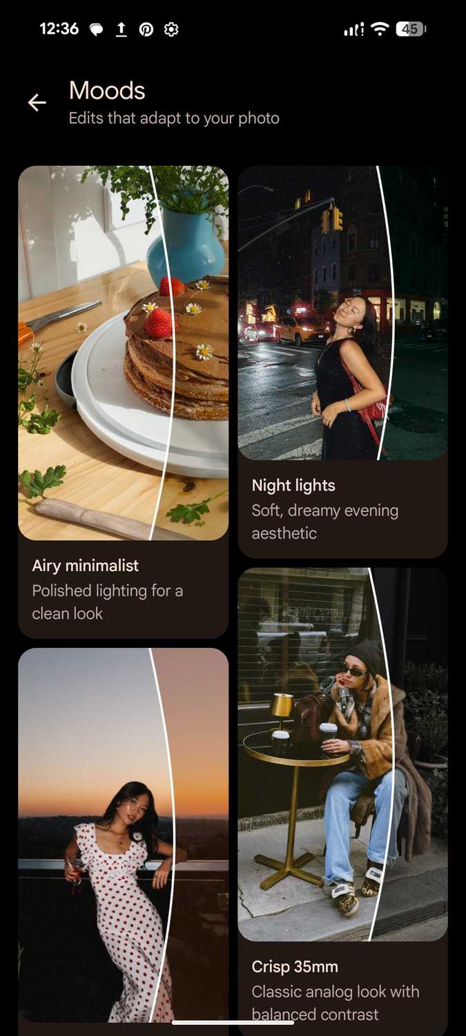
There are seven Moods at the time of writing: Crisp 35mm, 2000s Night, Retro Contrast, Night Lights, Blue Haze, Airy Minimalist, and Rich Textures.
They are similar to Photos' existing filters. Neither gives you granular control of the underlying settings. It's my only peeve, because I'd have loved to steal the recipe.
After all, filters are generally a combination of curated and selected adjustments, like contrast, highlights, saturation, and grain.
However, Photos' older filters, like Playa, Honey, Isla, Desert, and the black-and-white set from Ollie to Astro, apply the same fixed adjustments to every picture. They can become muddy when the light leans that way.
Moods are more adaptive, and even Google says they read each image first to tune the effect intelligently. Its own wording points to machine learning, although it doesn't confirm that Gemini is behind it.
Regardless, it offers benefits in mixed lighting from a photo dump after one long day. You could shoot in bright daylight outside, move indoors under bulb conditions, then take a few with the flash at night.
Normally, daylight produces around 5,500 to 6,500 Kelvin and reads neutral to slightly blue. A household bulb produces 2,700 to 3,000 Kelvin and throws everything toward an orange tone.
Flash is balanced close to daylight, so it lights your face neutrally while the room behind you remains yellow. My wedding and event photographer friends deal with this dynamic all the time.
It's why they rarely paste one preset across a whole gallery and walk away. The preset is a starting point. Then they correct each frame's white balance by hand.
I have the borrowed prestige of Crisp 35mm
There's a history lesson in every frame I edit
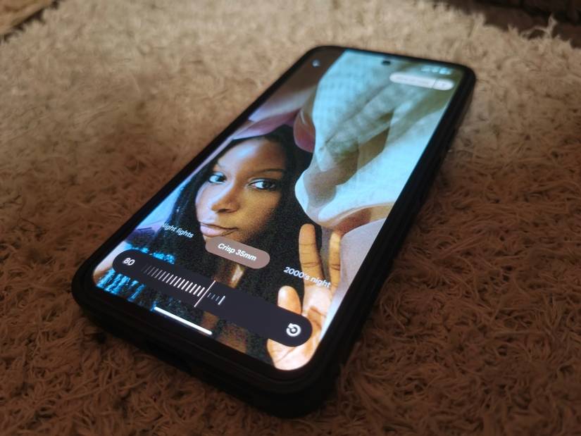
My favorite Mood is Crisp 35mm. It's named after a format that produced most photographs from the last century.
Traditionally, on a professional camera, the frame measures 36mm by 24mm on a strip of perforated film that's 35mm wide.
Basically, it's like the filmstrip icon you've probably seen in video editing apps and old movie posters: a black ribbon with little holes down both edges and pictures lined up in a row between them.
Leica popularized it in the 1920s. For context, Leica is the German camera maker behind some of photography's most respected lenses.
It's also a name that now appears behind many of Xiaomi's flagship phones. So, 35mm became the default standard for everything from family albums to war photography.
This doesn't mean that the Photos app enhances picture quality to match a pro camera. At best, Moods works on top of processed images and only changes tones and contrast.
It can't add detail the sensor didn't capture. Also, phones have much smaller sensors than such cameras and lean on software processing to make up for it.
I'm grateful I can nail exposure and detail aspects in-camera, then treat the grade as a separate, non-destructive layer post-shooting.
It's almost the same workflow professional colorists use in film, and what makes Photos feel like a photographer's friend.
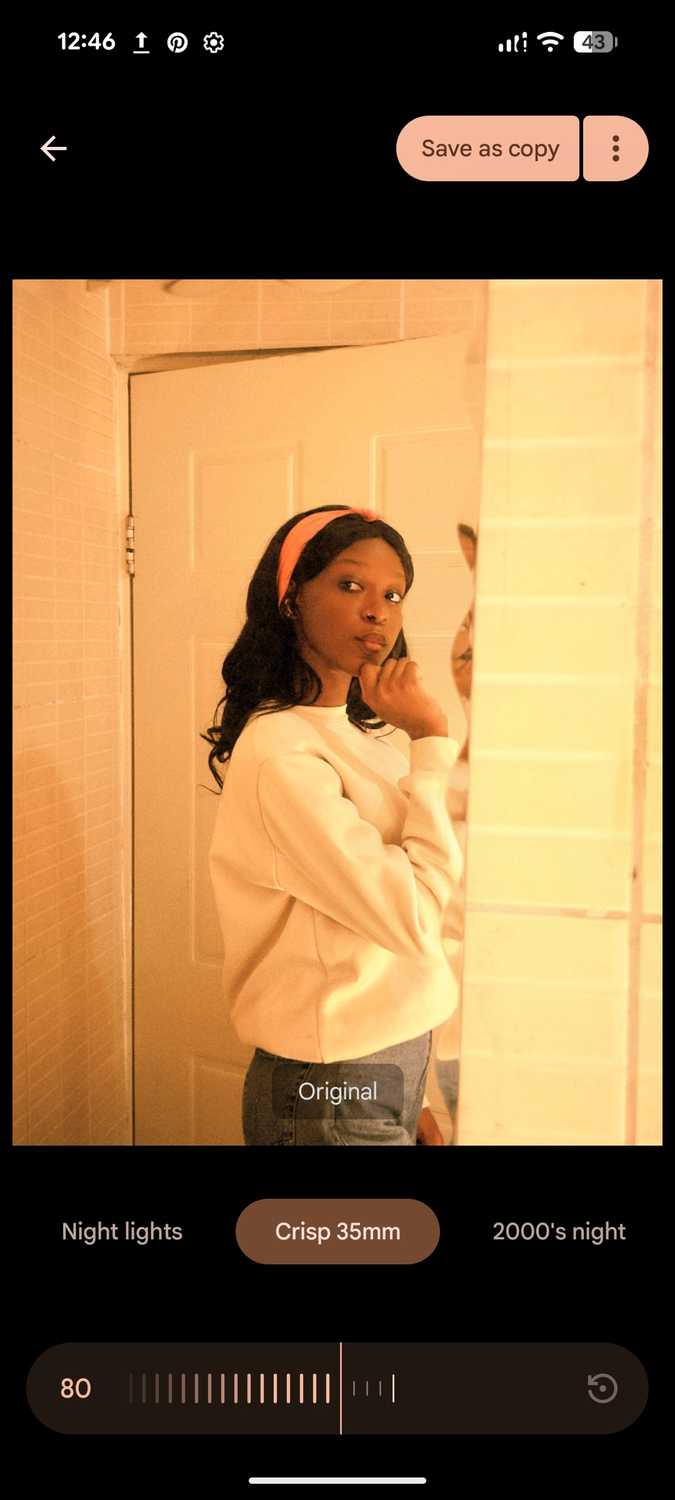
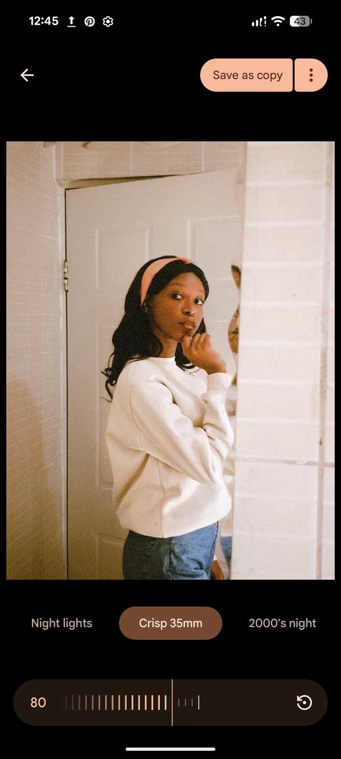
One time, I ran a mirror selfie through Crisp 35mm at 80% intensity. The original had an overwhelming yellow-orange cast bleeding across the tiled walls, the door, and my white sweater.
After the edit, the door and walls were closer to a realistic off-white tone, and my sweater looked white again instead of custard-colored. Plus, the shadows on my face and hair looked natural instead of melting into the background glow.
For comparison, I ran the same photo through a batch of regular filters on the app, including Honey, Isla, Desert, and Clay. Each one layered its own fixed tint over the same blown-out yellow base.
The photo stayed as warm, if not warmer, and as flat as the original.
There are never dull moments with Photos
Moods, in combination with the right camera settings, make every day a top-tier photo shoot. I recently learned that it gets better with advanced Pixel phones that ship with P3-ready screens.
I can with photos in the camera app, which captures in the wider Display P3 color space with roughly 25% more range than the default sRGB.
If I pair it with the RAW + JPEG setting, my phone can retain more of the sensor's original data.
That way, Moods have more color to work with and produce smoother results than a standard JPEG with 256 steps of brightness per color channel.