- Microsoft is rolling out a new font for Microsoft 365 apps
- The 'Michelangelus' font is based on Michelangelo's handwriting
- However, it's a loose digital interpretation, and some feel that the font and the real handwriting are 'wildly different'
Think fonts are boring? Well, that's fair, they certainly aren't the most interesting topic on the planet, but every now and then one comes along that does make you sit up and take notice.
A case in point (12-point, perhaps) is that as Microsoft announced in a blog post, Michelangelo's handwriting is being rolled out to Microsoft 365 users – or a modern approximation of it at least.
The 'Michelangelus' font has been created as part of the anniversary of the consecration of St. Peter's Basilica, which took place 400 years ago (on November 18).
The font was made to be used for digital and printed materials relating to the Basilica, as well as signage inside the building, but the decision was made to share it with the world via Microsoft Office.
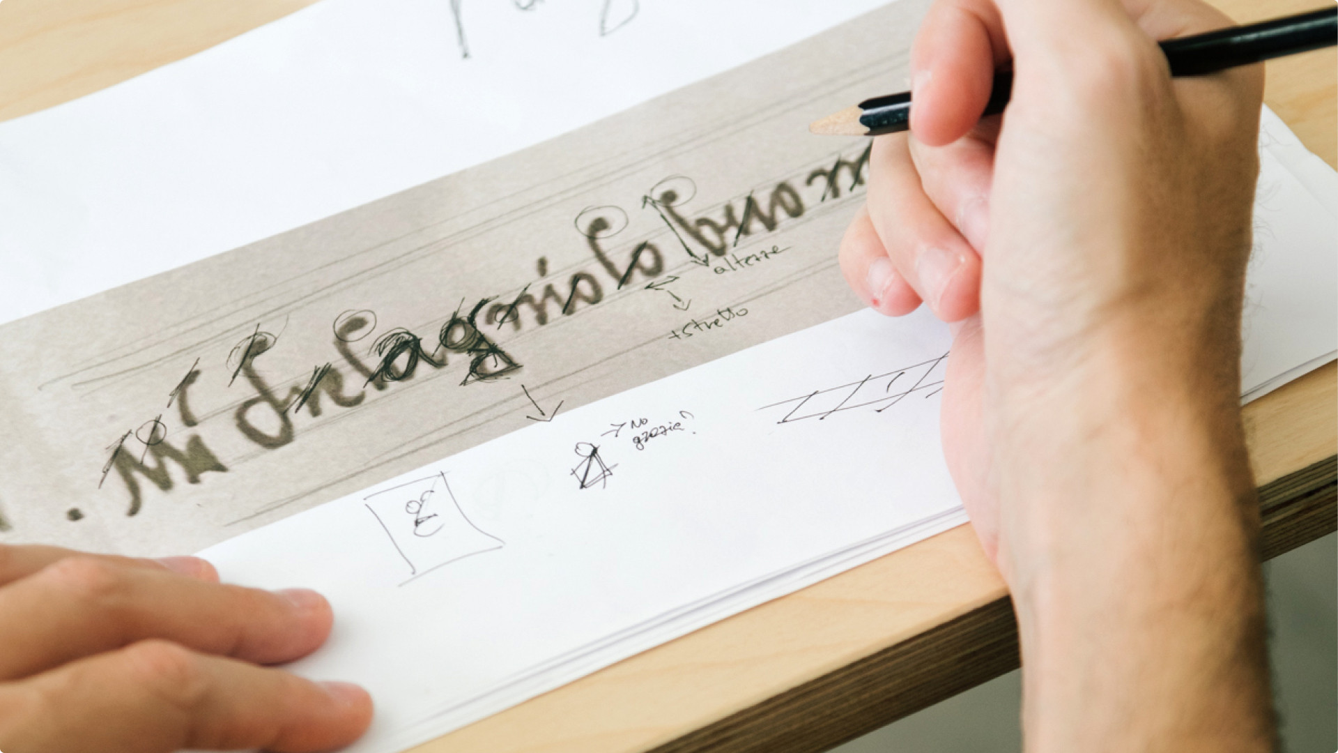
An Italian design agency, studiogusto, was commissioned by the Fabbrica di San Pietro to turn Michelangelo's characters into digital versions, noting that the idea was not a direct imitation of his handwriting, but to "adapt it through design into a modern tool."
Mimmo Berterame, the CEO of studiogusto, noted that: "For him [Michelangelo], [writing] was about clarity and respect for the reader. So, beauty was important, but it also needed order. Our typeface needs character and personality, but it also needs to be clear and easy to read."
In other words, the font is a modern approximation of his penmanship based on the 'rules' and feel of the writing style, so it doesn't look too over-the-top, but it still maintains some of Michelangelo's flourishes (like dotting the top of the 'h').
Analysis: fun with fonts
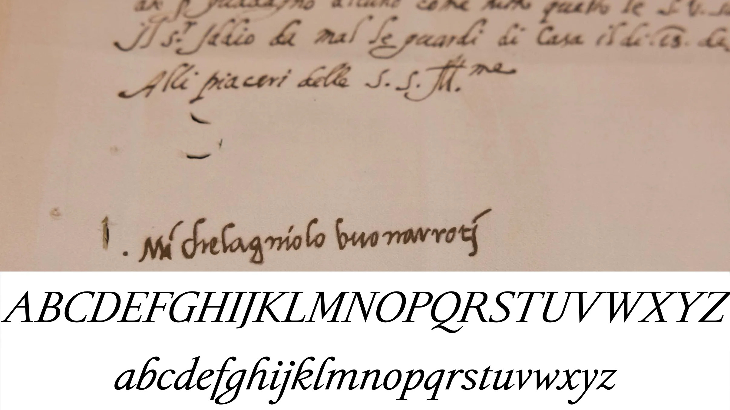
Some of the reaction to the font has veered towards the less-than-impressed in terms of the resemblance of the digital letters to the real handwriting. As one Redditor says: "That is certainly a very loose interpretation of the phrase 'based on.'"
A reply points out that the official press release from the Basilica di San Pietro explains that: "The typeface draws inspiration from Michelangelo Buonarroti's bold, expressive handwriting. However, it goes beyond a mere reproduction of the artist's graphic style and an imitation of his calligraphic techniques.
"The ambition is broader: to identify within his handwriting a visual logic, a system of proportions, rhythm and harmony measured by the artist's eye, and to translate this into a contemporary typographic system."
However, the original poster remains largely unmoved, noting that: "That's a noble goal and an ambitious approach, but I really don't feel their execution lives up to their intent."
Somebody else observes: "Among many other characters which don't even come close, the capital letters A and M in this interpretation are wildly different. I don't get the feeling of handwriting at all from it."
I can see where the criticism is coming from, and it stems from the fact that the design is clearly titled much more towards clarity and a more contemporary, readable look, than it is the actual handwriting. Still, regardless of how you gauge the interpretation here, the end result looks very smart.
Si Daniels, who is Principal Product Designer, Office Design, explains that the new font will be rolled out to Microsoft 365 apps at the end of the year. However, if you can't wait, you can manually download and install it from here.

Darren is a freelancer writing news and features for TechRadar (and occasionally T3) across a broad range of computing topics including CPUs, GPUs, various other hardware, VPNs, antivirus and more. He has written about tech for the best part of three decades, and writes books in his spare time (his debut novel - 'I Know What You Did Last Supper' - was published by Hachette UK in 2013).