
The One UI 9 update, based on , is one of my favorite builds ever to grace my Samsung Galaxy devices.
I tested it on my Galaxy Flip 7 and peeled back many layers, finding it remarkably impactful for .
However, it also introduced an overhauled cover screen design featuring the new Now Brief screen, a dedicated app drawer, and revamped gestures.
While the fresh layout aims to improve the outer panel's productivity and usability, reception is mixed. The biggest issue is that it changes the previous layout and third-party launchers, which can be frustrating if you rely on muscle memory.
Fortunately, I found a trick to reclaim the classic cover screen, at least in part, and here is how I did it.
One UI 9 makes my cover screen more productive
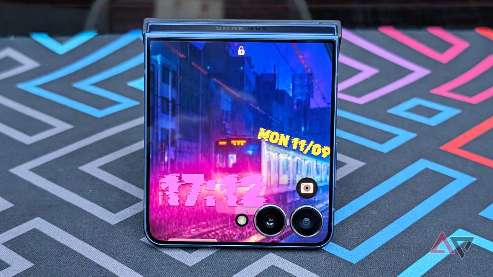
With One UI 9, Samsung redesigned the cover screen experience with the Galaxy Z Flip devices. While the cover screen still feels familiar, it adds .
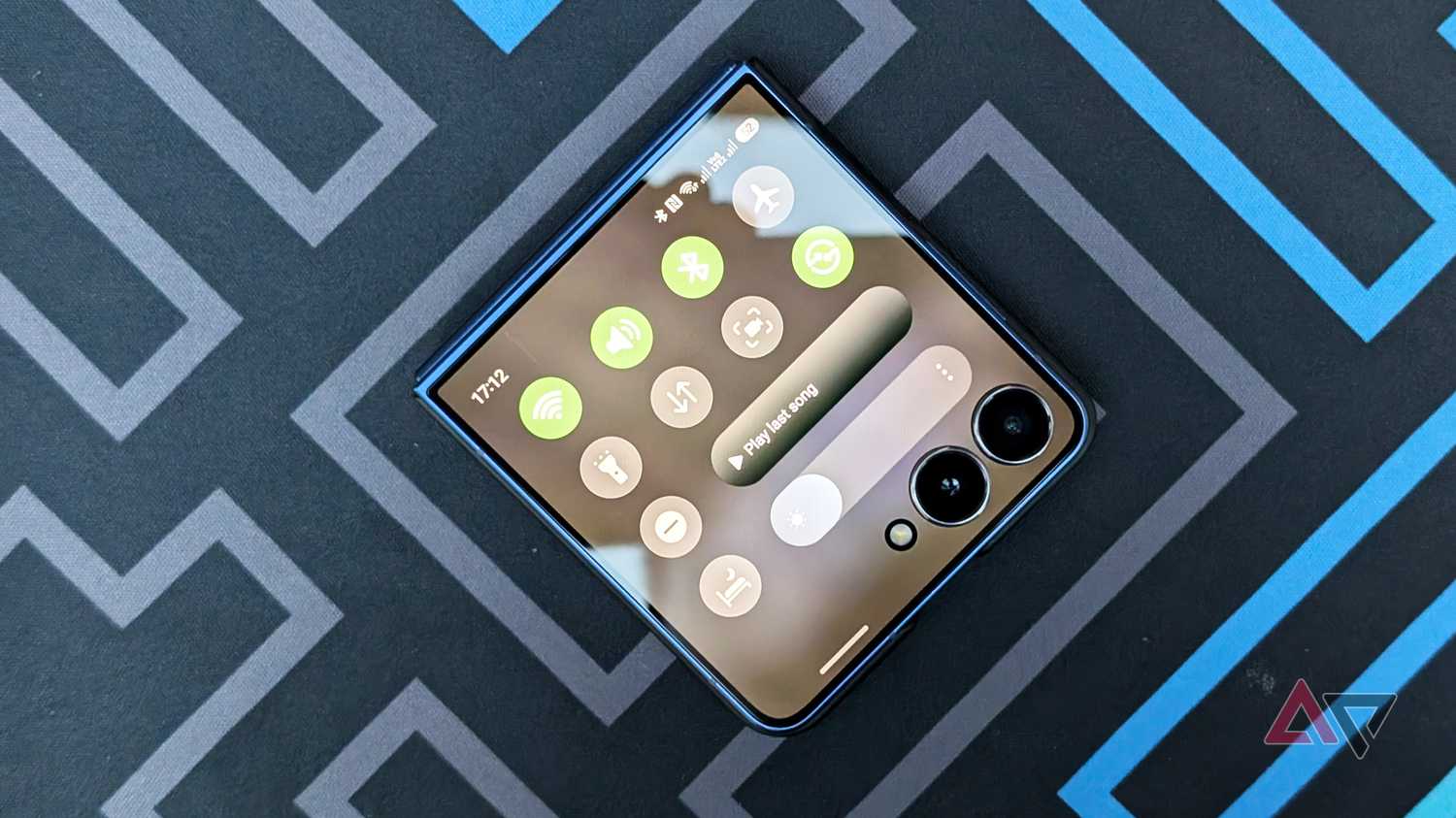
First, you can now access the by swiping down from the left, while swiping down from the right reveals the .
Previously, I had to swipe inward from the left edge to open the notifications panel, while swiping down was reserved solely for the quick settings shade.
When viewing notifications, I can also scroll vertically to navigate through notifications, and there is a convenient one-tap clear button.
I find the new gesture faster and more intuitive for triaging notifications, though it takes a brief adjustment period before it becomes muscle memory.
Now Brief is now the main cover screen view
App drawer is an invaluable addition
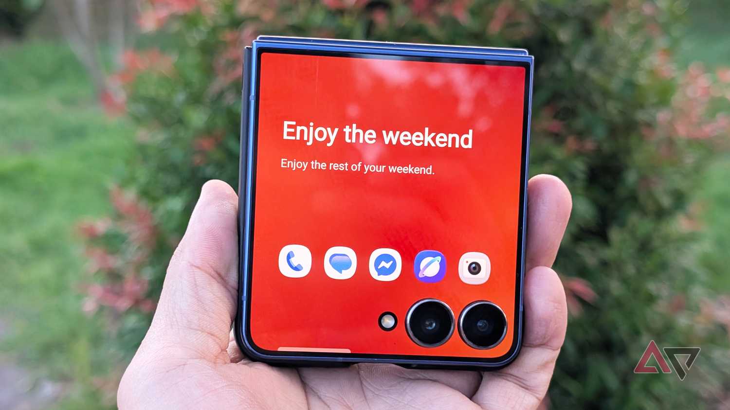
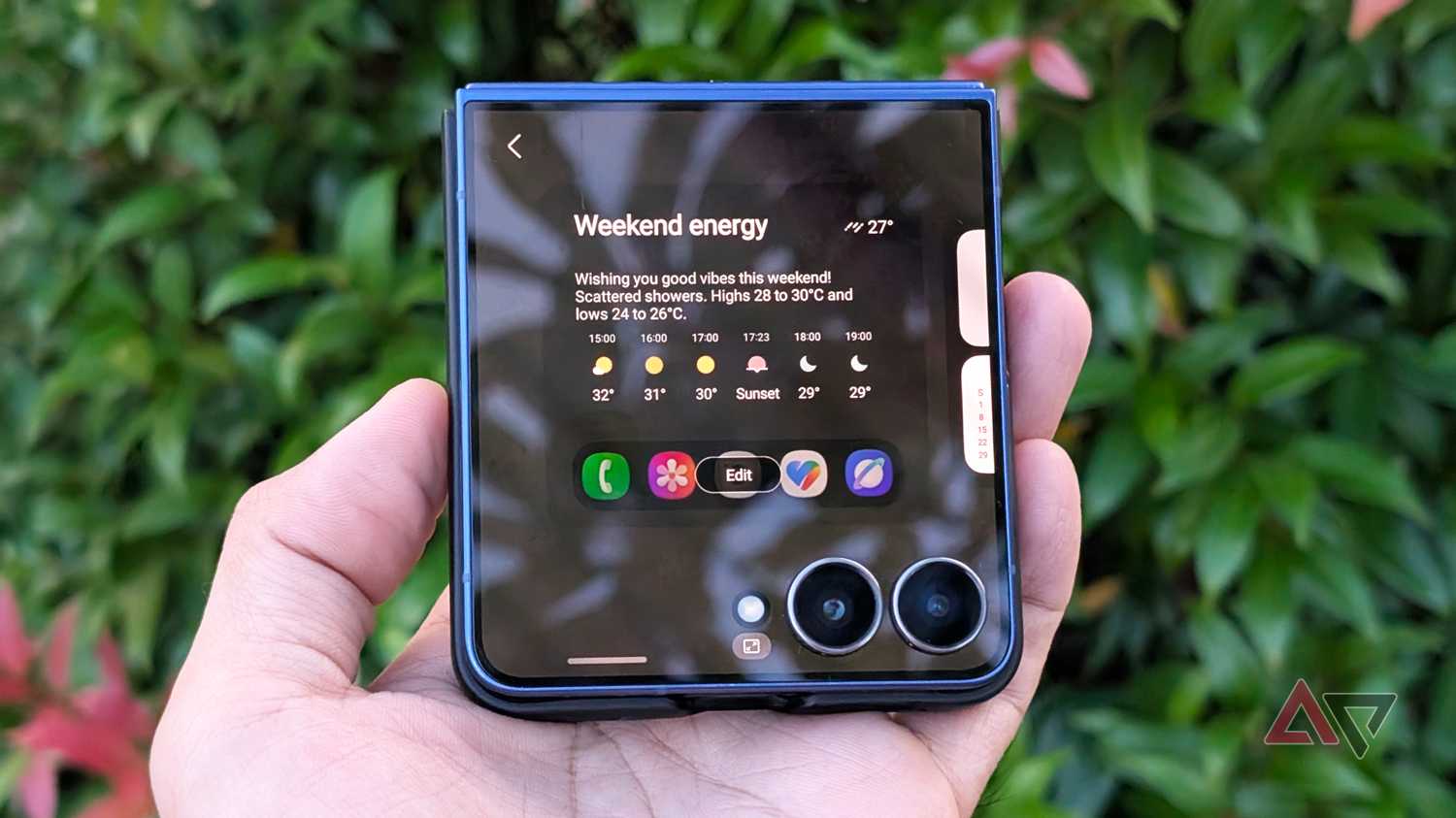
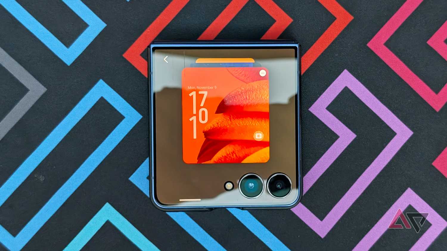
Next is the most controversial addition: the or screen, which replaces the traditional cover screen (though you still get it as a lock screen).
It serves as the default, sticky screen you cannot reposition among other widget pages, though you can turn it off entirely (more on that below).
It includes a large weather widget that takes up most of the display and a new favorite-apps dock at the bottom.
In this dock, you can pin up to five favorite apps, customize them, or mirror your primary home screen.
For instance, I added the Phone dialer, Messages, Messenger, my web browser, and the Camera, but you can leave this row empty or select only a couple of shortcuts.
The rest of the widget panels in a carousel are accessible by swiping from the right edge, allowing you to manage them by rearranging, deleting, or editing elements like app rows and clock styles – though not with the Now Brief screen.
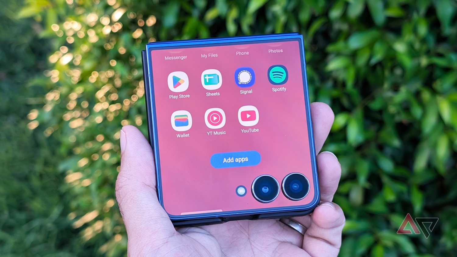
You can also swipe up from any widget page to reveal the cover screen .
This gives you access to a wider catalog of apps, which you can expand to 50 apps using the MultiStar module in Good Lock.
I find this the most useful addition in the entire update, since it removes the need to rely heavily on MultiStar or third-party launchers just to squeeze more apps onto the cover panel.
How I hide the Now Brief widget screen
I replaced it with a more practical screen
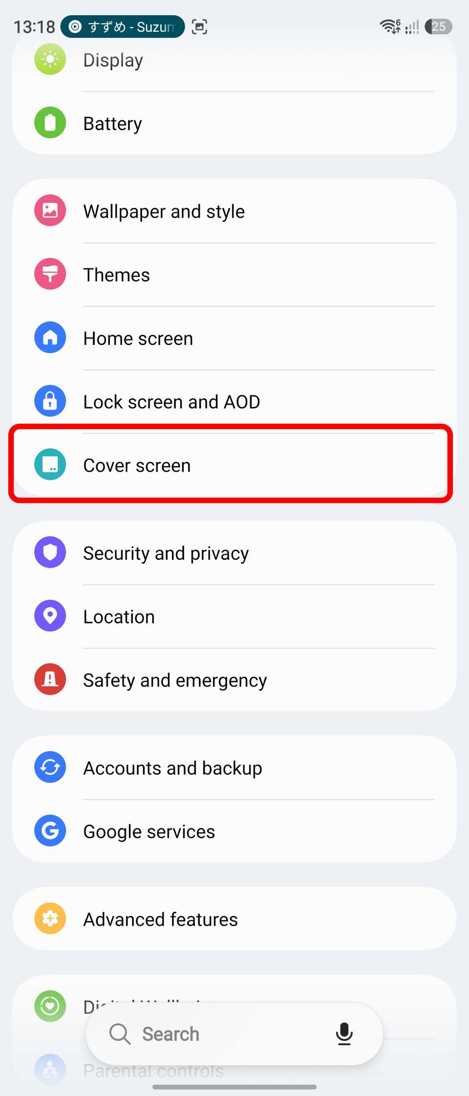
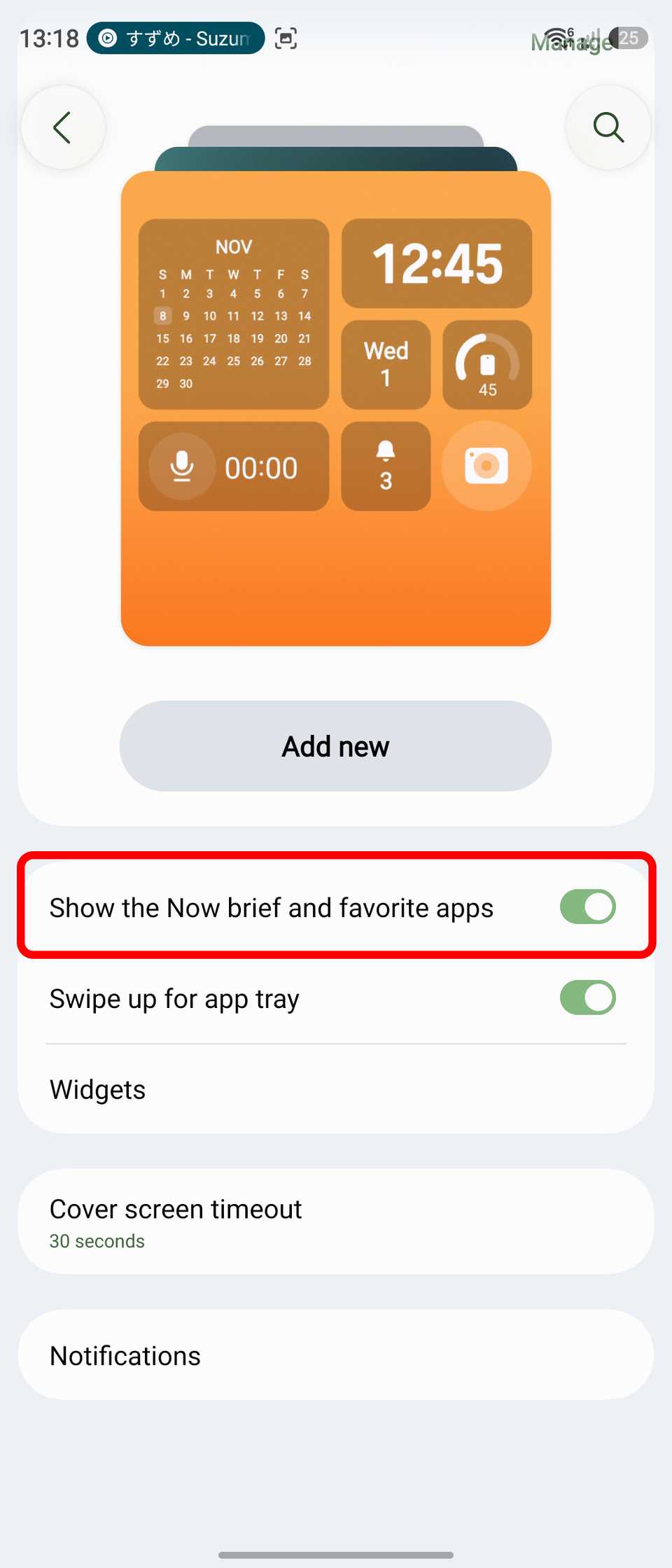
While I was initially annoyed that the new Now Brief interface lacked layout flexibility, a simple switch in Settings completely hides it from the cover screen.
To do that, unfold your Flip, go to > Cover screen, and toggle off , which are enabled by default.
Keep in mind that disabling this also removes the bottom dock of favorite apps.
When you're done, your carousel starts with your first custom widget page, and you can reorder or tailor the remaining panels however you like.
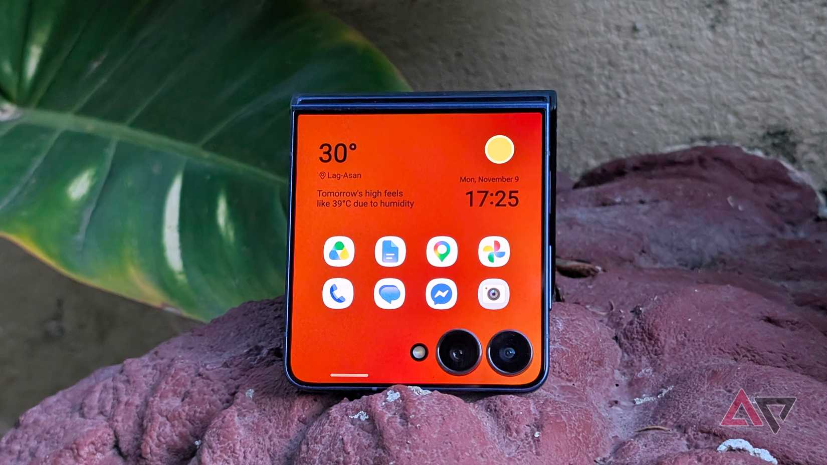
In my case, I preferred having a clean clock or weather widget alongside a 4x2 app grid packed with my app shortcuts.
I prefer this approach over relying on the app drawer, since it saves an extra swipe-up and lets me launch my most-used tools faster.
Likewise, I like One UI's versatility because you can customize these widget screens exactly how you prefer.
My only minor quirk with these custom app widgets is that they lack notification badges or indicators, so you will not know about unread messages or missed calls without pulling down the notifications panel or glancing at the lock screen.
You can customize Now Brief content in the main settings by creating and adding your own cards or choosing which apps to show.
Samsung's cover screen is great if you know how to customize
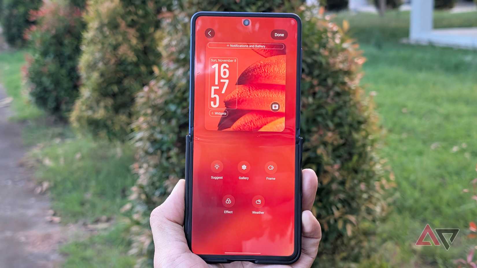
I both love and hate the updated cover display interface in One UI 9.
The dedicated app drawer and new swipe gestures are genuinely handy and improve daily productivity compared to older One UI versions.
However, what I cannot stand is how Samsung forced the rigid Now Brief screen and left very little customization.
But if you are just as annoyed by the new screen, you can hide it entirely and build your own snazzier cover screen style.