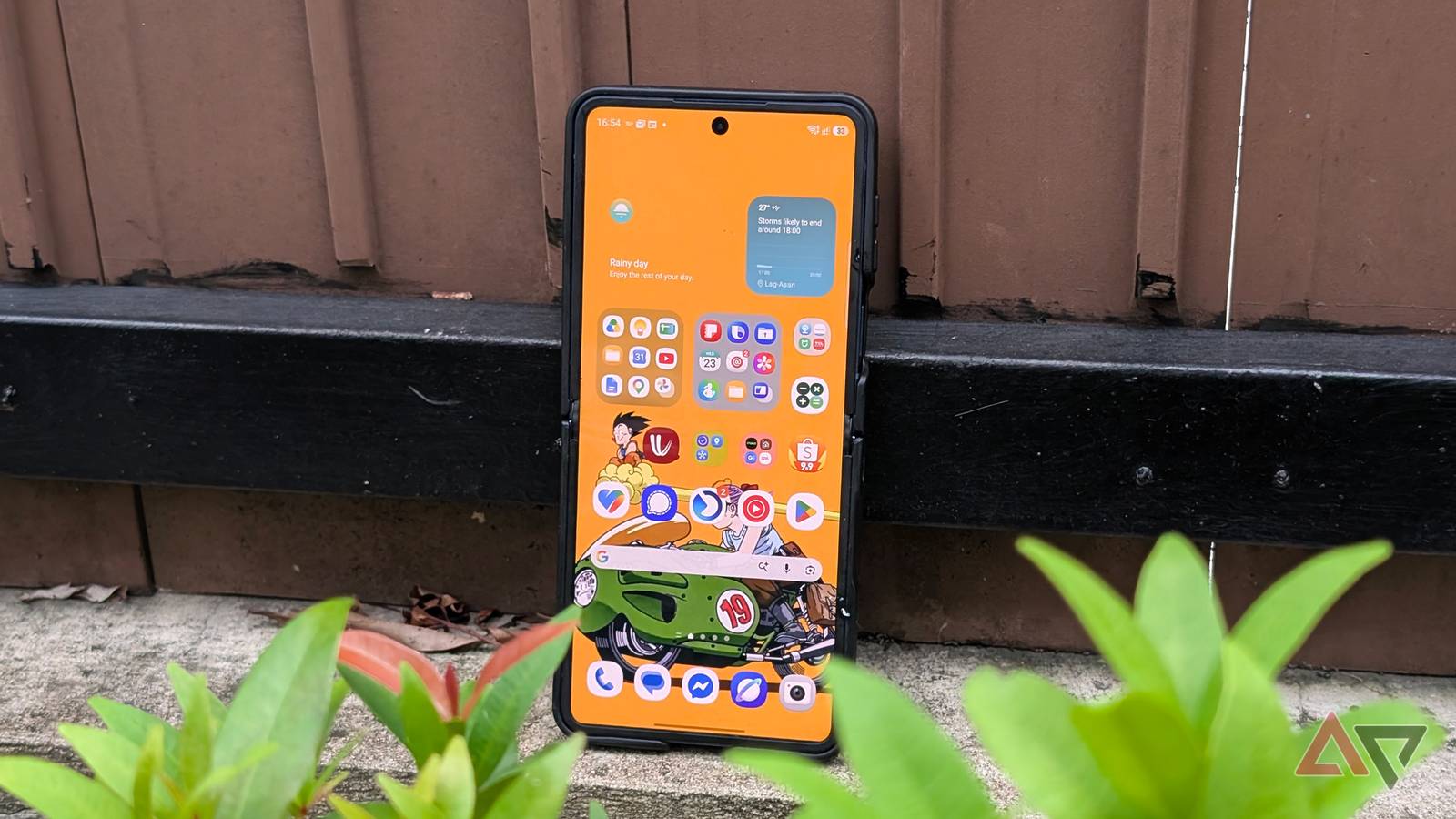
I spend a lot of time tweaking my Samsung home screen, but most changes usually end up being cosmetic.
I move a few icons around, swap the wallpaper, resize a widget, and then forget about it a day later.
This time, though, I found a that changed how I use my home screen: stacked widgets.
It helped me fit more useful information into the same space, cut down on unnecessary pages, and made the entire setup feel much cleaner without sacrificing functionality.
My Samsung home screen was getting too crowded
Too many widgets, not enough space

I like having useful information available the moment I unlock my phone, so widgets have always been a big part of my Samsung home screen.
Over time, though, things started getting messy.
I had separate widgets for weather, calendar, reminders, notes, and a few other apps, and each one was taking up valuable space on my Samsung Galaxy S25 Ultra.
Before long, I was either shrinking widgets too much, pushing icons onto another page, or creating extra home screens just to fit everything in.
That defeated the whole purpose for me. I wanted my home screen to feel useful, but I also wanted it to look clean and easy to scan.
Removing widgets wasn't an option because I use them throughout the day.
I needed a way to keep the same information within reach without letting every widget claim its own chunk of the screen.
Stacked widgets solved the space problem
Borrowed straight from iOS
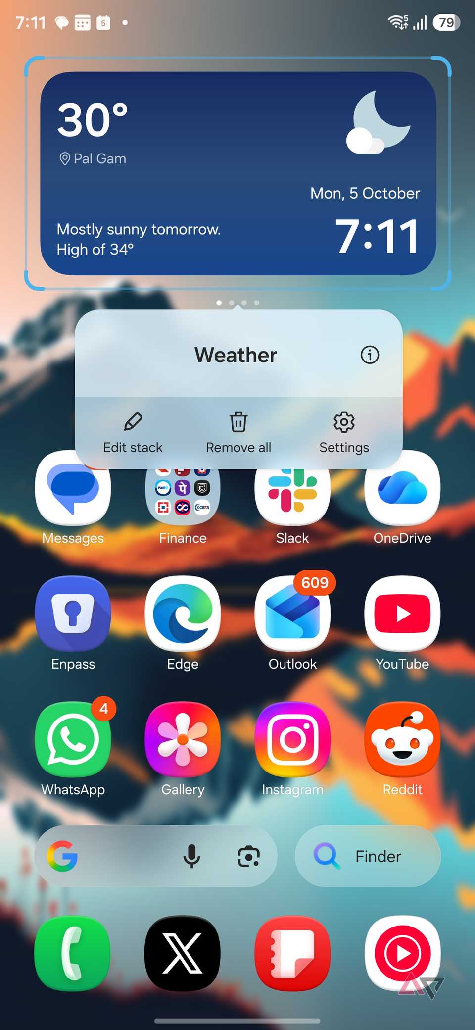
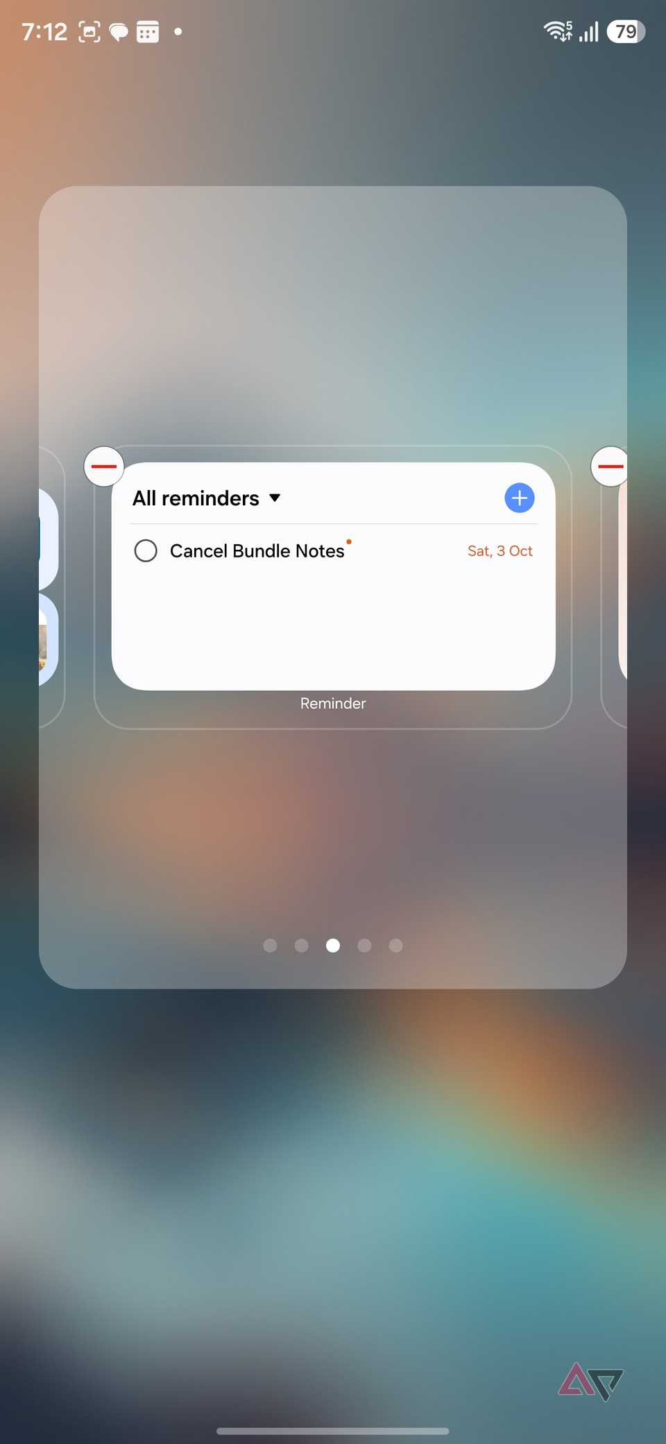
Samsung's stacked widgets solved this problem almost immediately.
Instead of dedicating separate chunks of my home screen to Weather, Finance, Calendar, and Notes, I can place several in the same spot and swipe through them when I need something.
It sounds like a small change, but it makes a huge difference when I am trying to keep my home screen useful without turning it into a wall of information.
The idea isn't exactly new. Samsung's implementation feels heavily inspired by Apple's widget stacks on iOS, where multiple widgets can occupy the same space and be cycled through.
I am perfectly fine with Samsung borrowing a good idea when it actually improves the experience.
I wish Google would take note here.
Pixel Launcher widgets look clean, but managing several of them can still eat up a lot of home screen space.
A proper native widget stacking system would make Pixel home screens much more flexible without adding unnecessary complexity.
I built different stacks for different jobs
Setting up a widget stack is easy
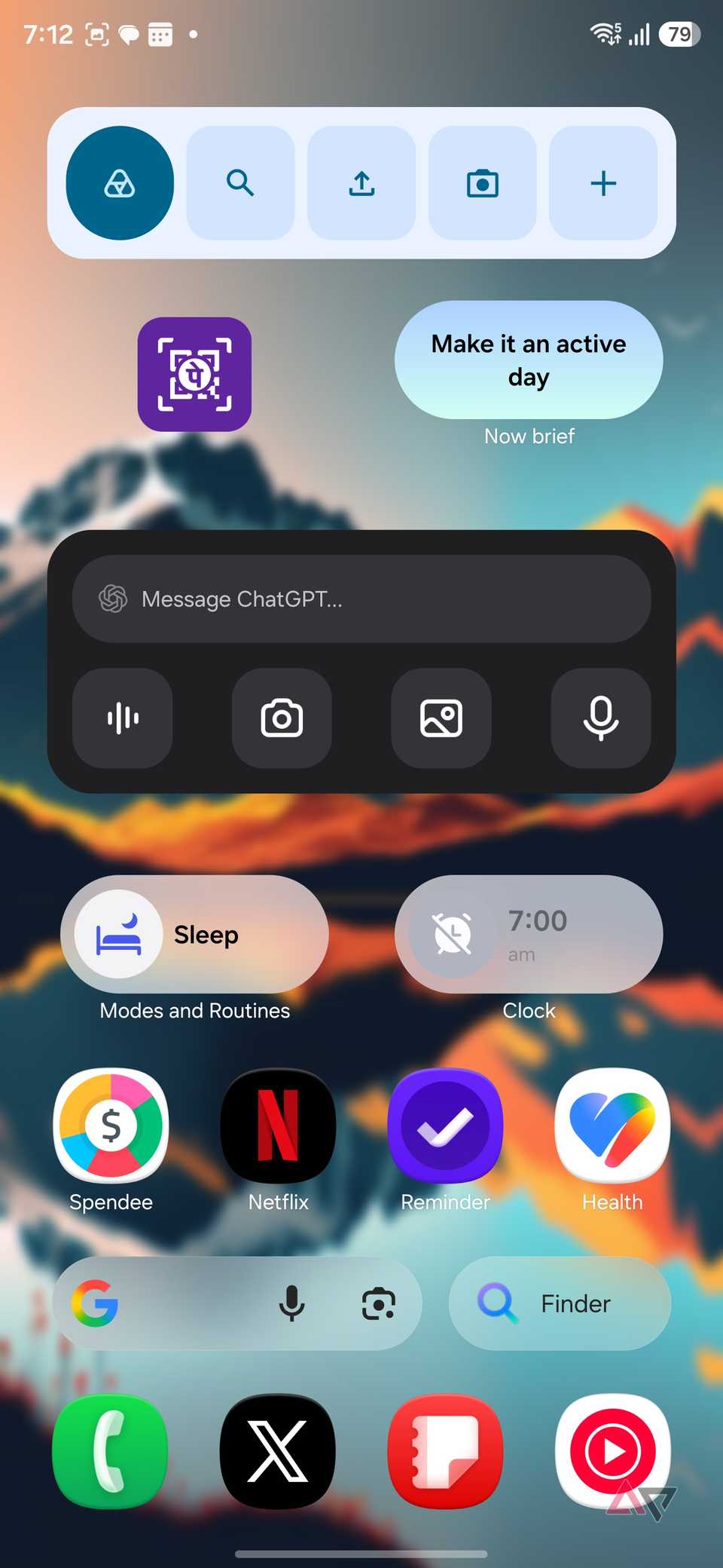
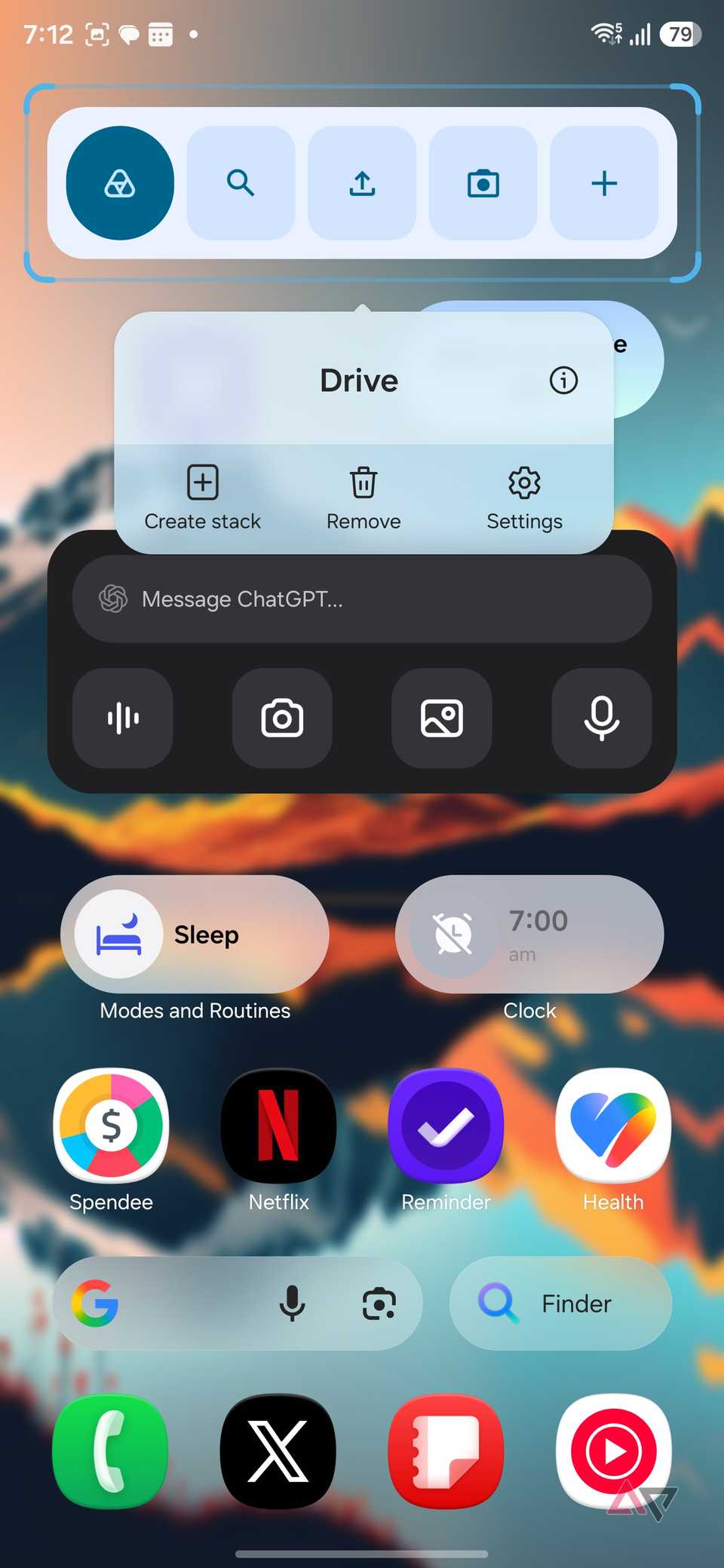
One reason I kept using stacked widgets is that Samsung makes the setup simple.
I start by adding a regular widget to the home screen, resizing it how I want, then long-pressing it to add another widget to the stack.
From there, I can add compatible widgets and swipe horizontally between them when I need something.
I also like that I can rearrange the widgets later instead of rebuilding the entire stack from scratch.
If I start checking Calendar more often than Weather, I can move it closer to the front.
Instead of throwing random widgets into the same stack, I started grouping them based on what I use them for.
My planning stack, for example, can contain Calendar, , and Weather, since those are the things I usually check when figuring out my day.
I can keep a separate productivity stack for Samsung Notes, Slack, email, and other work-related widgets, while another stack can focus on media or smart-home controls.
This approach works much better for me than having one giant stack with everything inside it.
It reduced the number of home screen pages I need
It changed how I think about Android widgets
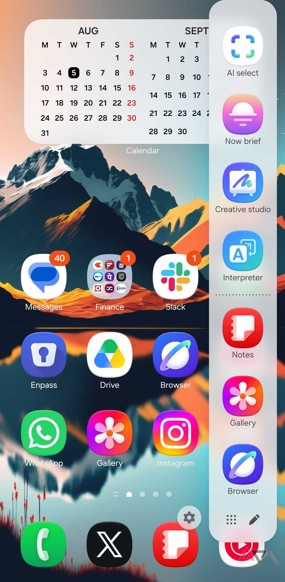
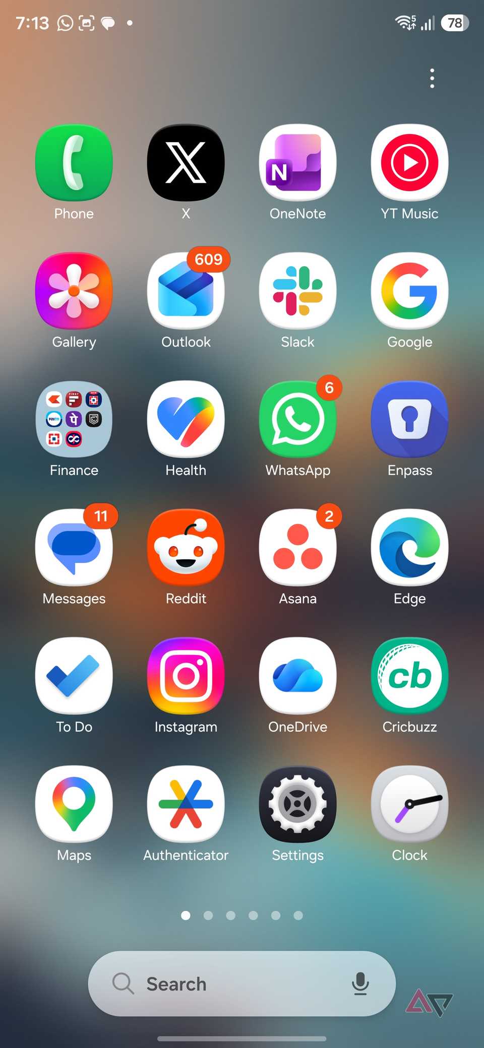
Before I started using stacked widgets properly, I had five home screen pages on my Galaxy S25 Ultra.
That gave me enough room for widgets, folders, and shortcuts, but it also meant a lot of swiping to reach something.
After I started stacking related widgets, I trimmed the setup to just three pages without losing anything important.
Now, my main page handles the information I check most often, while the other two cover the rest of my workflow.
I also rely heavily on the Edge panel for frequently used apps and shortcuts, so I rarely need to open the app drawer.
Create a smarter setup
Stacked widgets are one of those One UI features that seem minor until you build your home screen around them.
My home screen now feels organized around how I use my phone instead of looking like a collection of random widgets.
Samsung already gives me plenty of customization options, but stacked widgets are among the most practical.
If your Galaxy home screen is starting to feel crowded, this is a feature I would definitely try.